The Task:
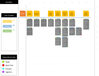
T-Mobile was looking to disrupt more than just an industry, it was looking to change/simplify/improve everything about how its customers pay for their T-Mobile service.
The Result:
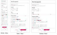
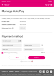
- Simplified bill payment flows reduced customer confusion by streamlining the choice of payment options and making paying your bill much simpler and easier.
- Redesigned Payment plan flows reduced support costs and reduced customer stress by allowing customers to initiate payment plans themselves, with clearly laid out terms, rather than risk disconnection for non-payment.
- Consistently applied UX patterns across the site reduced customer frustration with a clean, simple, easily parsed layout and reduced clutter allowing the customer to quickly view and pay their bill.
- Responsive UI lets customers stay on top of their bill by letting them easily schedule one-time payments, setup Autopay, or setup a Payment Plan from any device.


