
T-Mobile Visual Voicemail

About Visual Voicemail
The original Visual Voicemail (VVM) design dates back to its initial release in 2010 and definitely feels every bit of its advanced age. The app came preloaded on all Android phones purchased through T-Mobile and Metro and offered rudimentary organization, saving, transcription, and sharing of voicemails.
It was, for its time, instrumental in bringing voicemail out of the analog age; allowing customers to access all their voicemails at any time without requiring arcane keypad entries, entering PINs, or slogging through voice menus. Yea, we really had to do that back in the day. Remember “press 7 to delete”? It was awful!
Project Overview
Role & Responsibilities
UX Design Lead
Native App Design
User Research
Prototyping
Accessibility
Platforms
Android
Major Milestones
Public Launch: 2022
Project Directive
Boasting a tens of millions strong install base and millions of daily users but a flagging rating in the Play Store coupled with a decade old design rooted in antiquated dial-in voicemail paradigms, it was clear that a wholly new approach was needed to deliver what customers needed in a voicemail app.
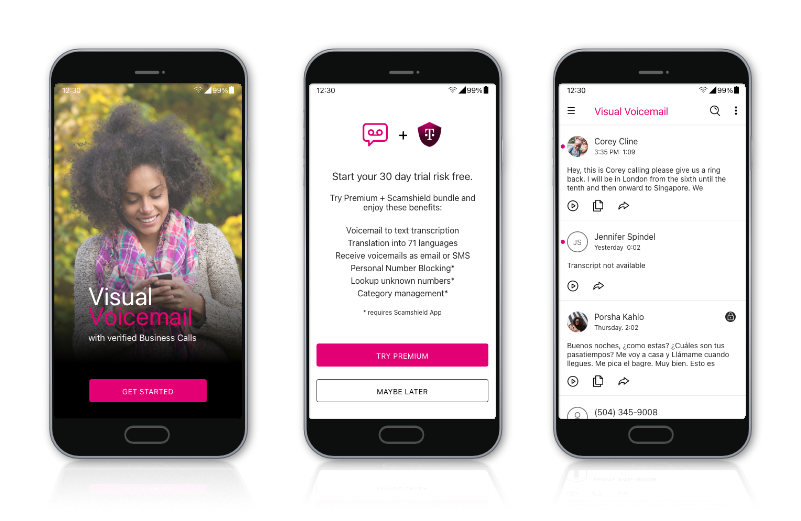
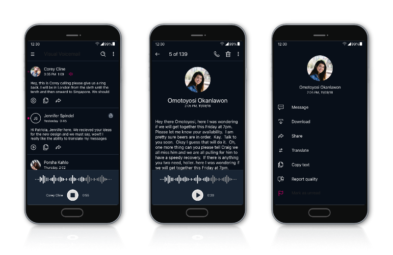
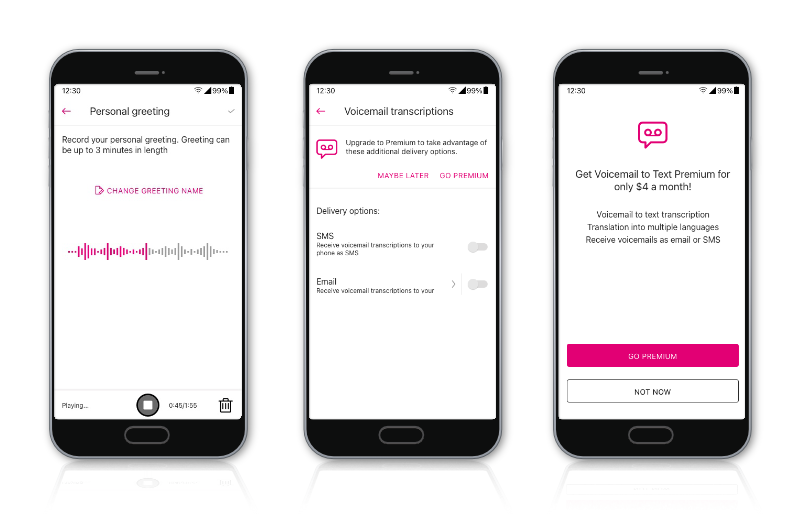
I was asked to wipe the slate clean and redesign Visual Voicemail with a focus on meeting customer expectations in the era of always-on, always-connected, always-there cloud computing and unlimited high-speed data. Beyond delivering simple voicemails, I designed new ways for customers to secure, save, share, and experience their voicemails beyond simply listening to and organizing them. With a massive customer base, this new app would have the opportunity to delight tens of millions of customers every single day, so it had to be clean, efficient, powerful, and, above all, simple and easy to use.
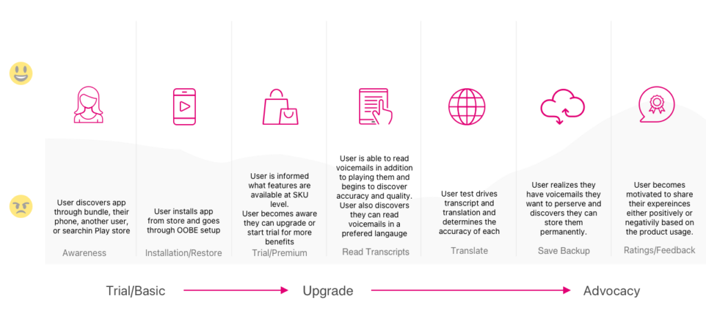
Customer journey map.
My Approach
As the Lead Product/UX Designer working alongside key members of the Engineering and Product Marketing teams, I was tasked with the goal of reimagining the Visual Voicemail (VVM) customer experience from beginning to end.
My initial research confirmed the existing app suffered from being designed around an outdated modality: it was modeled to mimic legacy dial-in, audio-only voicemail systems. In addition to being designed for 1970s landline phones, the UX was clunky and obtuse, failed accessibility testing, and didn’t meet brand standards.
Reimagining Voicemail
To get the ball rolling, I first performed a competitive analysis of competing apps in the marketplace. From there, I aggregated customer feedback from App Store reviews and interviewed Customer Support SMEs who supported VVM in order to establish a matrix of feature requests, customer pain points, and common issues.
Using this data I built out a product vision proposal: outlining proposed new features, projecting customer impacts these new features would have, and sketched out some design concepts and a visual design framework in order to show my vision for the massive value an improved VVM product could bring to T-Mobile customers. I presented this vision to my leadership and immediately got the go ahead to begin design work in earnest. I then began the journey from Concept to Product.
Design and User Testing
With approvals in hand the next step was to turn those ideas into something tangible. Combining the Visual Design language I established in my concepts with the journey maps I’d constructed previously, I proceeded to design some customer key journeys in order to prove out the high level concepts I’d previously sketched out.
In addition to designing full end-to-end journeys in high fidelity, I designed and documented interactions, error states, and created a modular design component library facilitate iteration during the design process without sacrificing visual fidelity or getting stuck making manual corrections and alignment tweaks to elements on-screen. Because of building at high fidelity early on, we were able to conduct guerrilla user testing with clickable prototypes to get continuous feedback throughout the design process.
As many employees are T-Mobile customers and VVM users this feedback came from real VVM customers so it was vital in ensuring our designs would meet out customer’s high expectations. This continuous testing and iteration helped identify a number of crucial issues early on, proving crucial to the project’s short design timeline and overall success.
Accessibility
When the designs nearly complete, I prepared a package for T-Mobile’s incredible Accessibility Resource Center (ARC) Team to review, with the aim of ensuring that every T-Mobile customer, regardless of their accessibility needs or differing abilities, was able to get the full VVM experience. Coming out of this review process, I worked with the accessibility team to document the required behaviors when accessibility controls like screen readers or navigational aids were enabled and ensured text and element colors met contrast and legibility standards, and supported screen reader parsing at all contrast levels and UI scaling sizes.
Lasting Customer Impact
While the VVM redesign is not yet released, I anticipate the new design to resonate with customers. While typical voicemail offerings would rarely factor into a customer’s decision to switch to T-Mobile, the innovative new functionality and simple yet powerful UI is an important part of T-Mobile’s service offerings. My hope is that the new functionality I’ve added coupled with the modern UI, simplified interactions, and more organic user experience will address all the lingering customer pain points and longstanding issues from the old VVM. And building on that, the new VVM will enable customers to quickly and easily migrate data from one device to another, more easily consume their voicemails regardless of the language they speak (or the language others might speak in their voicemail), and securely save or share voicemails that have sentimental value. While VVM isn’t strictly a revenue driver for T-Mobile, its an important part of T-Mobile’s service offerings and they type of innovation my designs have enabled will help accelerate T-Mobile’s continued industry leading subscriber growth.